How to Make a Chart in Excel


In this tutorial, you will learn completely how to make a chart in excel. A chart can help you to visualize the data you process in a meaningful way.
Data visualization is an important thing to master if we work with data, especially the complex one. It can make our data processing results much easier to digest and taken important insights from.
As excel is primarily a data processing software, mastering data visualization in it is therefore essential to do. Understanding how to create an excellent chart in it will go a long way to help us do that.
Are you ready to learn how to make a chart in excel? Read all parts of this tutorial below!
Disclaimer: This post may contain affiliate links from which we earn commission from qualifying purchases/actions at no additional cost for you. Learn more
Want to work faster and easier in Excel? Install and use Excel add-ins! Read this article to know the best Excel add-ins to use according to us!
Table of Contents:
How to Make a Chart in Excel: Step-by-Step
The way to create a simple chart to represent your data in excel is quite easy. Just follow these steps below to do it.-
Highlight the cell range which data you want to create a chart from. You should have the data in the form of adjacent and same-sized rows/columns for an easier chart creation process. Having column/row headers should help too in labeling the data automatically later in the chart

-
Go to the Insert tab and notice the charting area there

-
Click the dropdown of the chart type you want to use and choose your chart from its list
-
Done! You have created a chart from your data!
If you need to adjust the chart interface, then highlight the chart and go to the Chart Design/Layout tab. Set the interface you prefer for the chart from there

Excel Chart Types and When to Use Them
It isn’t too hard to create a chart for your excel data, is it? However, you might feel confused when trying to choose which chart can best represent the data you have.To help you with that, we will discuss the chart types in excel and when we generally should use each. Hopefully, this can help you choose the best chart for your data!
-
Column
A chart that illustrates your data in vertical bars. It is a great chart to use if you want to compare the quantities between your data categories vertically.

-
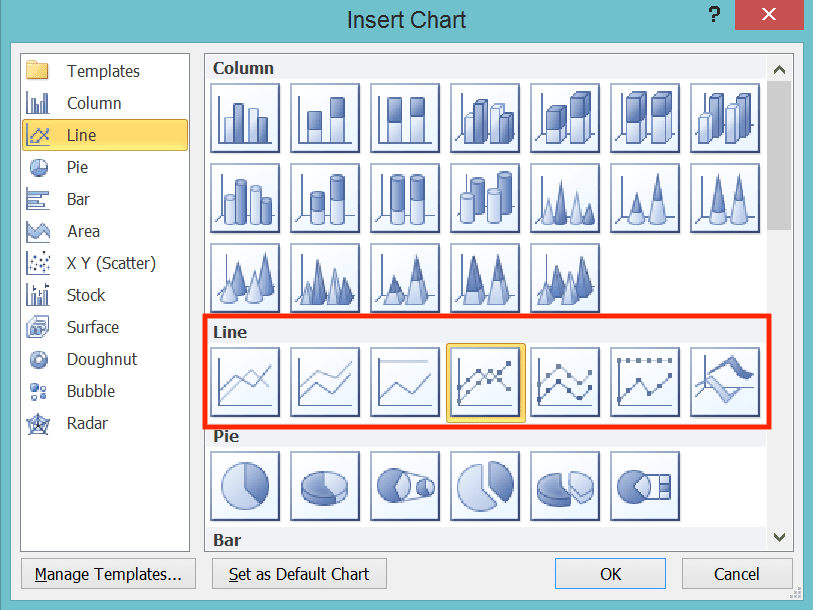
Line
A chart that illustrates your data in horizontal lines which move from right to left. You can also give dots to each of your data points in those lines if you want. It is a great chart to use if you want to show some progress from your data quantities (e.g. to illustrate data that categorizes itself in periods).
-
Pie
A chart that illustrates your data as portions of a full circle. It is a great chart to use if you want to compare the proportion of your data categories quantities in a 100% total percentage.

-
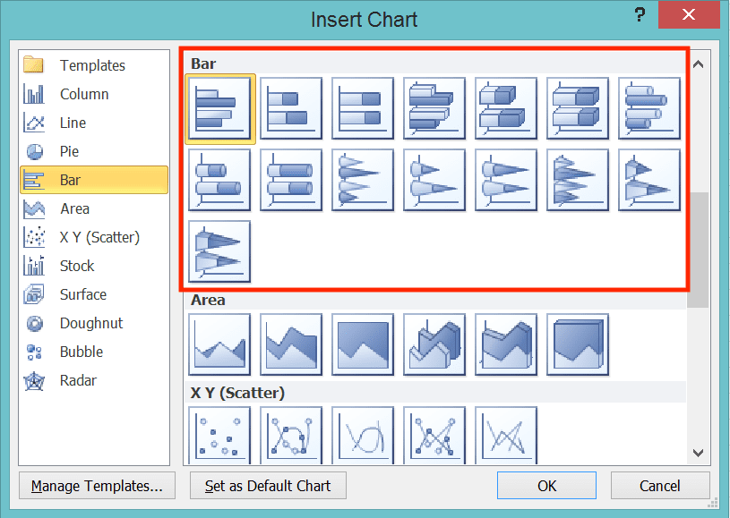
Bar
A chart that illustrates your data in horizontal bars. It is a great chart to use if you want to compare the quantities between your data categories horizontally.
-
Area
A chart that illustrates your data in areas fill. It is a great chart to use if your data categories can be assumed to overlap each other in their quantities (e.g. the profit of a company branch compared to the profit of the whole company). Moreover, you want to show the “contribution” quantity of one data category to another in your chart.

-
X Y Scatter
A chart that illustrates your data in dots which position themselves depending on their numbers. It is a great chart to use if you want to see your data distribution and correlation between each other.

-
Stock
A chart that illustrates your data in candlesticks like the ones you often see in stock analysis. You should use this if you have multiple data quantities in one category and you want to see their distance. You also want to compare the distances in all of the categories.

-
Surface
A chart that illustrates your data in area proportions. It is a great chart to use if you want to compare the coverage sizes of your data categories’ quantities.

-
Doughnut
A chart that illustrates your data as parts of a doughnut kind of shape. You should use this chart if you want to see the proportion of your data quantities to a 100% percentage total. It is a bit similar to the pie chart usability, albeit with a slightly different chart form.

-
Bubble
A chart that illustrates your data in circles with different sizes depending on its quantities. You should use this chart if you want to compare the correlation, distribution, and quantities of your data simultaneously.

-
Radar
A chart that illustrates your data in ranges from a central point to a different direction per data category. It is a great chart to use if you want to compare your data categories quantities in a scale.

Excel Chart’s Key Elements
In Excel, a chart has some elements you should understand if you want to optimally visualize your data with it. The understandability of your chart can improve considerably if you pick the right chart elements to show.Therefore, here is a list of those elements with their description so you can understand them completely. You can access their settings for your chart by highlighting your chart and go to the Chart Design or Layout tab (depending on your Excel version). From there, select the chart elements menu.
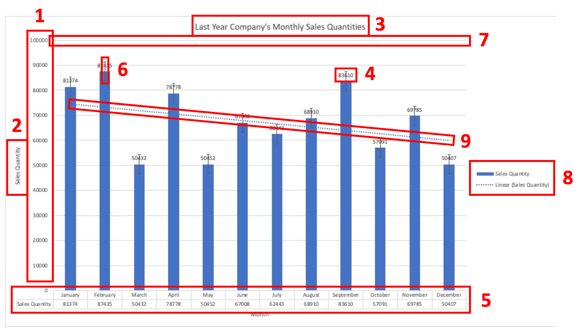
- Axis: the data categories/measurement ranges for x and y axes (if your graphic has axis)
- Axis title: the main theme of each x and y axis of the chart (if your graphic has axis)
- Chart title: the summary of the chart content
- Data label: the information of your data categories exact quantities
- Data table: the data you use for the chart in a condensed table form
- Error bar: the margin of error illustration of your data categories quantities
- Gridline: vertical and/or horizontal lines that serve as a background of your chart. It makes your data categories quantities comparison easier to see
- Legend: the information of what data that each of the chart contents represents (usually taken from your data headers)
- Trendline: the line which illustrates the fluctuation of your data categories quantities from one category to another category
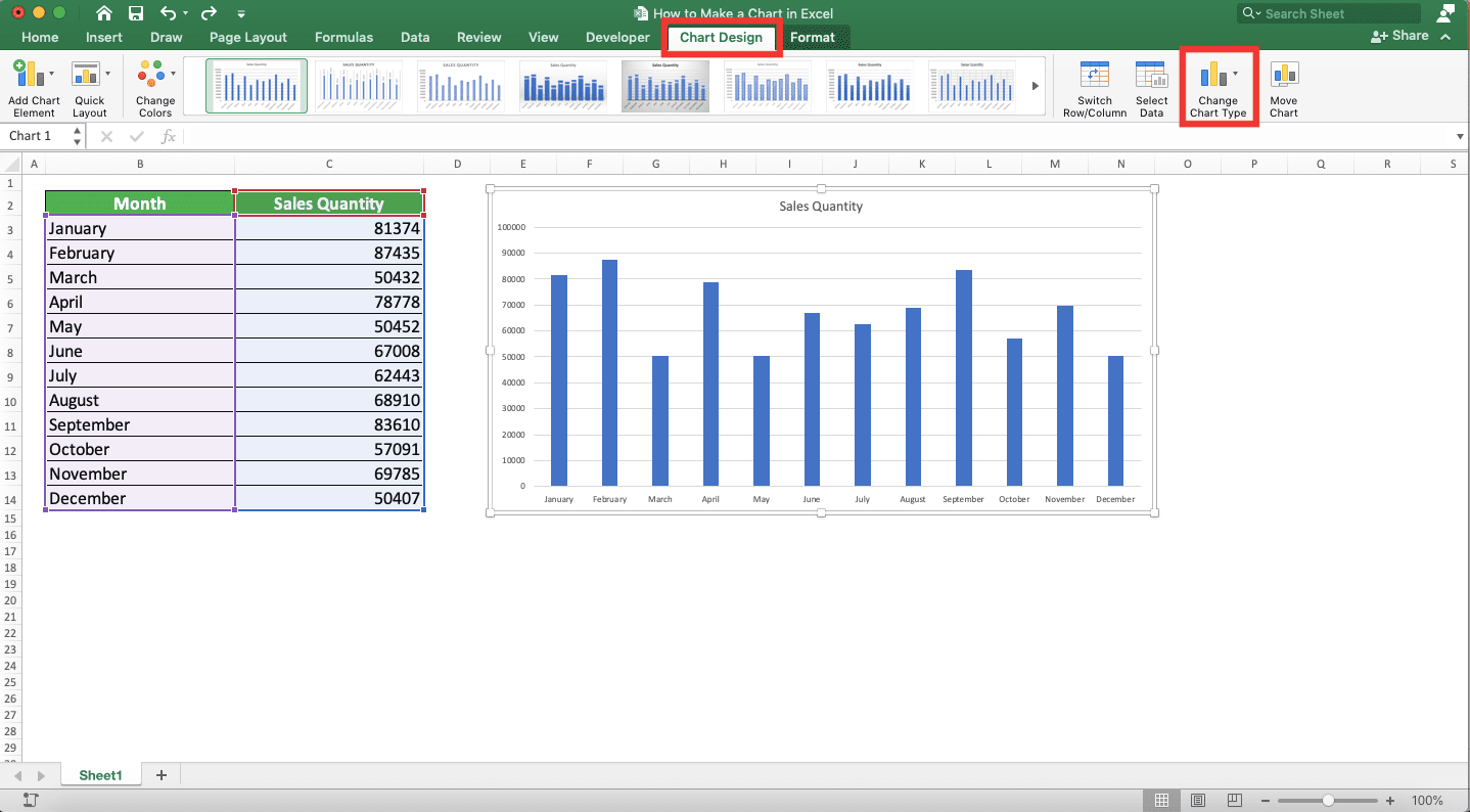
How to Change the Chart Type in Excel
After creating a chart from your data and see its form, you may think the chart type you choose is wrong. It doesn’t represent your data the way that you prefer.Is there any way to change the type of chart you have already created? Yes, excel actually provides a menu for that purpose. Just click the menu on your Chart Design tab and choose the chart type you want!
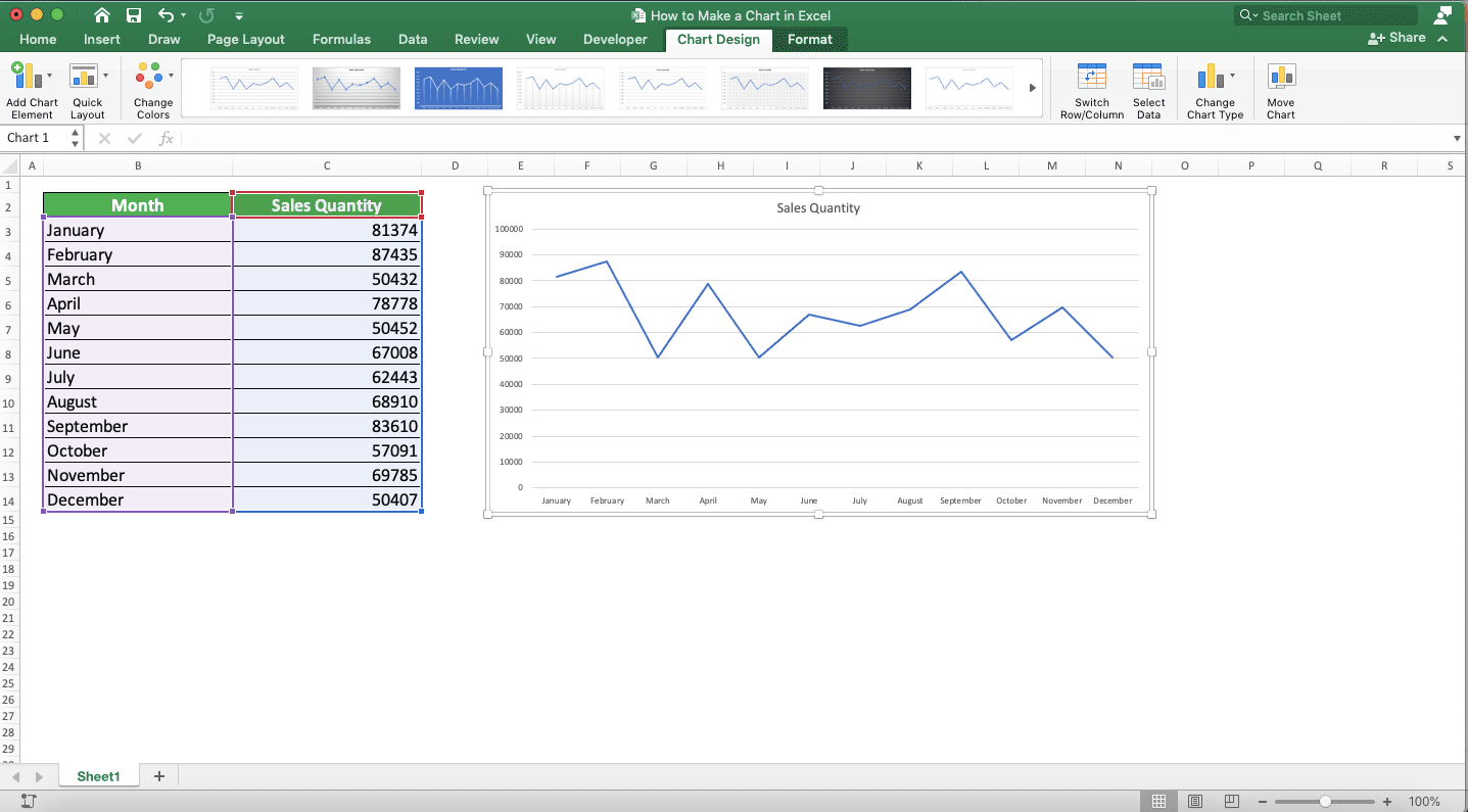
To illustrate the implementation, let’s say we want to change the type of this chart below into a line chart.
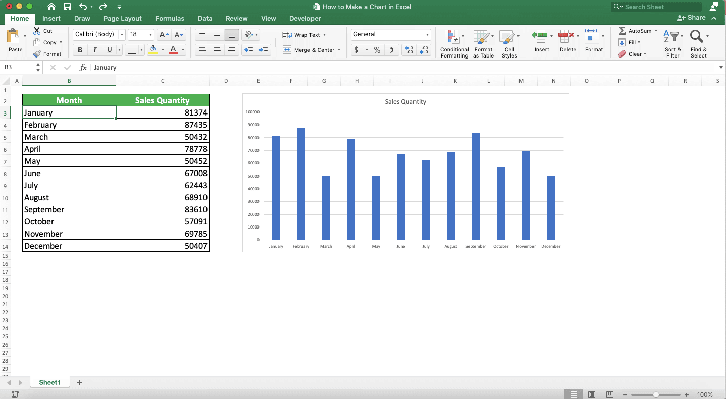
How can we do that? Well, just highlight the chart first, go to the Chart Design tab, and click on the Change Chart Type button.
Select the chart type you want to change your chart into. After that, your chart will convert itself to the chart type you choose!
Exercise
After learning how to make a chart in excel, let’s do an exercise in this part of the tutorial! This is so you can understand more practically what you have just learned!Download the exercise file and do all the instructions below. Download the answer key file if you have done the exercise and want to check your answers.
Link to the exercise file:
Download here
Instructions
Do each instruction on the appropriate sheet which corresponds to the instruction number! (1=Sheet1, 2=Sheet2, and 3=Sheet3)- Create a chart to visualize the data! Choose the most appropriate chart type according to the data you have there!
- Create a chart to visualize the data! Add a legend and data labels to the chart content! Choose the most appropriate chart type according to the data you have there!
- Create a chart to visualize the data! Remove the gridline & y-axis label and add a trendline! Choose the most appropriate chart type according to the data you have there!
Link to the answer key file:
Download here
Additional Note
The most used chart types to visualize people’s data are probably column charts, pie charts, and line charts.Related tutorials you should learn: